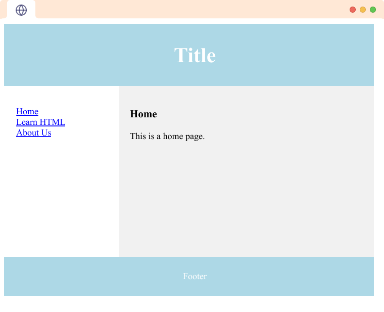
HTML layout refers to the way in which the content of a website is organized and structured. It makes the website easy to navigate. For example,

As you can see we have various contents on the page like heading, footer, the home page, etc in a structured way.
HTML Layout Elements
There are various HTML Layout elements. They are as follows:
<header> tag
A <header> tag defines the document's header. For example,
<header>codemy</header>
Browser output

<nav> tag
The <nav> tag represents a section of a page that links to other pages or to parts within the page.
<section> tag
The <section> tag in HTML represents a standalone section of content within a document. To learn more visit HTML <section>.
<article> tag
The <article> tag in HTML represents a self-contained piece of content that can be reused.
<aside> tag
The <aside> tag is used to represent a portion of a document that is indirectly related to the main content. It is most commonly used as a sidebar in the document. To learn more visit HTML <aside>.
<footer> tag
The HTML <footer> tag defines the footer of the HTML document or section. To learn more visit HTML <footer>.
<details> tag
The <details> tag provides additional details that the user can view or hide on demand. For example,
<details>
    <summary>Click me</summary>
    <p>Hidden content</p>
 </details>

The <summary> tag defines the visible heading for the <details> element. Here, if we click on Click me the Hidden content will be displayed.

HTML Layout
Let's create a simple layout using CSS.
<body>
  <div class="box">
    <section class="yellow">
    </section>
    <aside class="blue">
    </aside>
  </div>
</body>
  <style>
    .box {
      display: flex;
      height: 200px;
    }
    .blue {
      width:65%;
      height: 200px;
      background-color: blue;
    }
    .yellow {
      width: 35%;
      height: 200px;
      background-color: yellow;
    }
  </style>

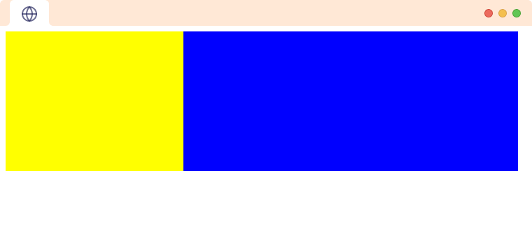
In the above example, we have created a <div> with a class box. Inside it, we have a <section> and an <aside> element with class yellow and blue respectively. We have used CSS to arrange the elements.
Notice, the code,
.box {
    display: flex;
    height: 200px;
}
Here,
display: flex- arranges the box next to each other in a rowheight: 200 px- sets the height to 200 pixels
Then, we have also used CSS for the <div> with class blue and yellow.
.blue {
    width:65%;
    height: 200px;
    background-color: blue;
}
.yellow {
    width: 35%;
    height: 200px;
}
Here,
width- sets the width of<div>height- sets the height of<div>background-color- sets the background color of<div>
We'll learn more about CSS layouts in our CSS tutorials.
Example: HTML Layout
<body>
    <header>
        <h2>Title</h2>
    </header>
    <section>
      <nav>
        <ul>
          <li><a href="#">Home</a></li>
          <li><a href="#">Learn HTML</a></li>
          <li><a href="#">About Us</a></li>
        </ul>
      </nav>
      <article>
        <h1>Home</h1>
        <p>This is a home page.</p>
      </article>
    </section>
    <footer>
      <p>Footer</p>
    </footer>
</body>
<style>
  * {
    box-sizing: border-box;
  }
  header {
    background-color: lightblue;
    text-align: center;
    padding: 2px;
    font-size: 25px;
    color: white;
  }
  nav {
    float: left;
    width: 30%;
    height: 300px;
    background: #fff;
    padding: 20px;
  }
  nav ul {
    list-style-type: none;
    padding: 0;
  }
  article {
    float: left;
    padding: 20px;
    width: 70%;
    background-color: #f1f1f1;
    height: 300px;
  }
  footer {
    background-color: lightblue;
    padding: 10px;
    text-align: center;
    color: white;
  }
  section::after {
    content: "";
    display: table;
    clear: both;
  }
</style>
Browser output
